Earlier this year, The Washington Post told a story about the effects of Coronavirus on the US workforce, and illustrated the story with grid charts.
Grid charts can show you the breakdown of the whole into constituent parts, to allow at-a-glance understanding of the big picture.
In this post, I’ll show you how to create a Grid Chart in Google Sheets.
💡 This was tip #128 of my weekly Google Sheets newsletter. Join over 35k+ others and receive the Google Sheets Tips newsletter for exclusive tips, tricks and Google Sheets news.
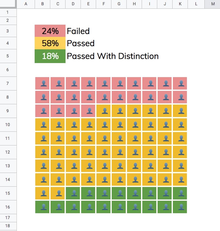
Here’s a fictitious grid chart example in Google Sheets, showing how students fared in an exam:

Changing the percentages in the cells above the chart will automatically adjust the chart colors to match.
1. Enter a % value in cell A1 e.g. 73%
2. Underneath, in cell A3, enter this SEQUENCE formula:
=SEQUENCE( 10 , 10 )This outputs a 10 by 10 grid of ascending numbers from 1 to 100.
3. Next, adjust the column widths (and row heights) so that the cells are square.
4. Wrap the sequence function with an IF statement and ArrayFormula to check whether the value in a given cell is greater than the threshold percentage:
=ArrayFormula(IF(SEQUENCE( 10 , 10 )> A1 * 100 , 2 , 1 ))Your output now will look like this:
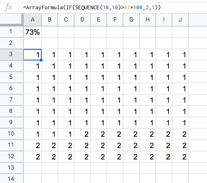
5. Highlight the 10 by 10 grid and add two conditional formatting rules:
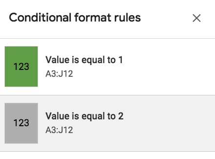
6. With the 10 by 10 grid highlighted, add thick white borders to separate the grids. Turn off the gridlines for the Sheet too, for an even cleaner look.
7. Keeping the grid highlighted, change the number format to a custom number format with the emoji symbol: 👤
Format > Number > More formats > Custom number format, then paste in the emmoji: 👤
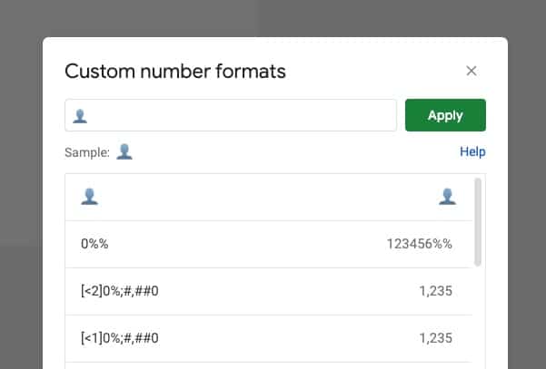
This changes all the values to 👤, regardless of whether it’s a 1 or a 2.
8. Finally, center-align the values horizontally and vertically:
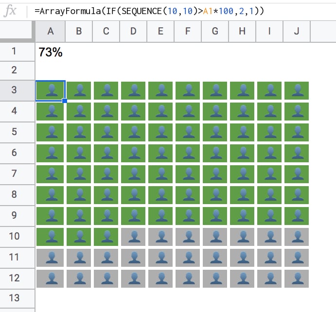
When you change the % value, the chart will adjust automatically for you.

To create the 3-color chart shown above, add an additional percentage value and modify the formula to compare against both percentage figures using two IF statements, e.g.:
=ArrayFormula(IF(SEQUENCE( 10 , 10 ) A1 * 100 , 1 ,IF(SEQUENCE( 10 , 10 ) A2 + A1 )* 100 ), 2 , 3 )))
In the second conditional test, you’ll notice I need to add percentage 1 and 2 together, to get the cumulative value at that point in time.
You also need to add an extra conditional formatting rule for the cells that have the value 3.
This will open a view-only version of the template. Feel free to make your own copy: File > Make a copy
(If you’re unable to open this file it may be because it’s from an outside organization, and my G Suite domain is not whitelisted at your organization. You may be able to ask your G Suite administrator about this.
In the meantime, feel free to open in an incognito window to view it.)
Can you make the multiple options case a bit tidyier by using the SWITCH() function, instead of multiple nested IF()s? To be honest, I haven’t tried using it in an ArrayFormula, and I also don’t know if you can match expressions in a switch, or just literal values.
Ben says:Hi Stu, Great question but I don’t think you can, because the switch is for checking equality only, whereas we need to do comparisons. I’ve included a template link at the end of the article now if you want to download and have a mess around with the formula. Cheers,
Ben
Hi Ben. Struggling to find the emoji symbol towards the end. Followed: Format > Number > More formats > Custom number format > ? Please advise. Tx.